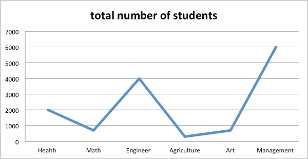
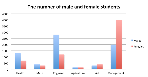
The graph and the chart below show the number of students choosing different kinds of courses in a particular university in 2012.


【Task 1- 混合图表-考核内容——对比同一时间 (2012年):各科总人数;男女人数】
Para 1 简述图表大致内容
Depicted in the line graph and the bar chart are students’ choices on six types of university courses in 2012.
Para 2 【线图——一般情况下,线图呈现数值涉及“变化”,但本题的线图侧重六个不同科目选课人数的对比,并未体现“变化”特征】
Most notably, the subjects of Engineering and Management were most desirable, as the numbers of students choosing them were 4000 and 6000 respectively. Distinct from these two courses, the four remaining spheres, Health, Math, Agriculture and Art, were far less popular, with the numbers being within a narrow range of 200 to 2000.
Para 3 【柱图——对比“不同性别”在六个科目上的人数差异:1.差异明显的学科:Management & Engineering; 2. 差异不明显的学科:Health, Math, Agriculture, Art】
When it comes to the choices on these courses by different genders, Engineering and Management also draw immediate attention, as a disparity was observed between males and females. Specifically, in the realm of Management, females were twice as many as their male peers. By contrast, the situation was enormously different in the course of Engineering. Likewise, as for the course of Health, males were twice as many as their female counterparts. In addition, the year of 2012 witnessed that the number of males paralleled that of females in the remaining courses.
Para 4
Overall, except in the courses of Engineering and Management, the numerical difference between males and females varied slightly from course to course.
0元领取剑桥雅思系列真题解析、托福TPO、SAT考试真题,更多独家资料免费领取。
