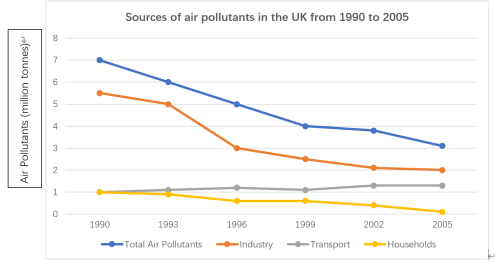
[2023/ 12/ 30] The line chart below shows the sources of air pollutants in the UK from 1990 to 2005.

【主体段分段】:
方法1:按照 趋势 分段【本篇文章采用此种分段方法】
- Body 1:total + industry
- Body 2:transport + household
方法2:按照 时间 分段
【开头段】
The line graph compares the number of pollutants released into the air from various sources in Britain between 1990 and 2005.
【概述段】
Overall, the quantity of pollutants released by the industry remained the largest throughout the period. Also, there emerged a falling trend in the total number of air pollutants.
思路要点:
- industry的污染物排量一直
- 总排量呈现下降趋势
【Body 1】
It is clear that the total number of contaminants to the air witnessed a significant drop from 7 to 4 million tonnes in the beginning 9 years. After a period of steadiness until 2002, this figure decreased marginally by 1 million in the final year. Likewise, a similar trend could be seen in the emission of pollutants from the industry. Its figure saw a slight fall from 5.5 to 5 million tonnes between 1990 and 1993, before declining sharply by 2 million tonnes in 1996. The last 9 years saw a gradual decrease to 2 million tonnes in this figure.
思路要点:
- 蓝色 总排量:前9年显著下降→到2002年平稳→到最后一年小幅度下降
- 橙色 industry排量:
- 也呈现下降趋势
- 1990-1993小幅度下降→到1996年急剧下降→最后9年年小幅度下降
【Body 2】
We can also find that in the beginning, 1 million ton of air contaminants came from transport, and this figure remained stable until 1999. Subsequently, there was a modest rise by 0.2 million tonnes in 2002, after which this figure kept steady until 2005. Although households emitted the same quantity of pollutants as transport in the original year, its figure underwent a slight drop by 0.5 million tonnes in 1996, followed by a period of stability in the subsequent 3 years. Afterwards, families reduced their emissions of pollutants until no contaminants were released in the final year.
思路要点:
- 灰色 transport排量:年1million ton→到2002年小幅度上升→到2005年持平
- 黄色 households:年和transport排量相同→到1996年小幅度下降→随后三年平稳→随后持续下降,直到最后一年为0
0元领取剑桥雅思系列真题解析、托福TPO、SAT考试真题,更多独家资料免费领取。
