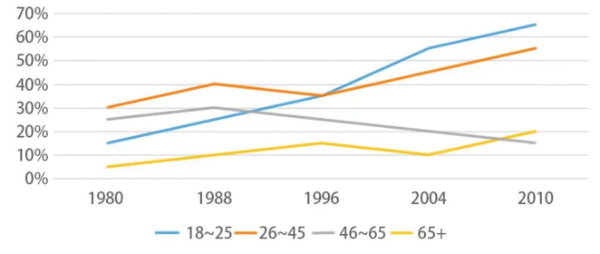
[2023/ 9/ 23] The graph below shows the percentage of people visiting museum once a month or more between 1980 and 2010.

【主体段分段】:按照趋势分段
【开头段】
The line graph compares four age groups that went to the museum at least once a month from 1980 to 2010.
【概述段】
Overall, only the percentage of people aged between 46 and 65 showed a downward trend. Besides, the most dramatic change could be found in the figure for the youngest group.
思路要点:
- 只有灰色整体下降趋势
- 蓝色变化幅度
【Body 1】
Originally, more people aged 26-45 visited the museum than other age groups, with the figure of 30%. Subsequently, this figure saw a noticeable climb to 40% in 1988, before falling slightly by 5% in the next 8 years. The last 14 years witnessed a sharp growth to 55%. Similarly, the proportion of young people(18-25) soared from only 15% in 1980 to almost 70% in 2010, overtaking the figure for the 26-to-45-year-olds in 1996.
思路要点:橘色+蓝色
- 橘色:年数据(30%)→显著上升到1988年达到40%→随后8年轻微下降了5%→最后14年急剧上升到55%
- 蓝色:从1980年的15%急剧上升到2010年的几乎70%,在1996年超过橘色
【Body 2】
We can also see that in the first 8 years, a marginal rise from 25% to 30% could be found in the proportion of 46-to-65-year-old people, after which there was a remarkable drop by 15% in the final year. Likewise, the figure for the oldest age group tripled to 30% in the beginning 16-year period, followed by a descent to 10% in 2004. Afterwards, this figure exceeded the percentage of people aged 46-65 and doubled in 2010.
思路要点:灰色+黄色
- 灰色:1980-1988之间从25%小幅度上升到30%→最终一年明显下降了15%
- 黄色:最开始16年上涨了3倍达到30%→2004年下降到10%→超过黄色,最终在2010年翻倍
0元领取剑桥雅思系列真题解析、托福TPO、SAT考试真题,更多独家资料免费领取。
